Monday, April 30, 2012
Sunday, April 29, 2012
MOMA
I
visited the Museum of Modern Art’s Cindy Sherman exhibit. It was one of
the best exhibits I’ve seen in a while and thoroughly enjoyed it. The
exhibits set up was the result of meticulous aesthetic consideration,
which furthered the viewing experience. Your initial sight when entering
the exhibit is massive images of Cindy Sherman blown up on the walls
outside the room in a variation of colorful costumes that grab your
attention and made you know what to expect.
My
favorite part of the exhibit was the room of the first black and
white images she did in the 1970s. I thought her ability to change and
alter herself before the age of digital photos was pretty amazing and
made me appreciate the images more. Although I enjoyed her earlier black
and white images, her newer images are still incredible and some were
really haunting (still thinking about this one).
She
uses close ups to capture a lot of things and show the detail on her
large variety of her character’s faces. Her newer images are a little
more dark and some almost grotesque which I found enticing, but also
hard to view for long. Something else I noticed and enjoyed was the
projection they had of Cindy Sherman’s name on the outside of the
exhibit shifted between fonts every few seconds, this can also be seen
online. Her ability to break the divide and be photographer, stylist,
and model in the majority of her images is an excellent reflection of
her skills as an all-around artist.
Before
I went to the exhibit I literally knew nothing about her work and one
of the aspects I enjoyed was the ability to take me through the various
stages of her work up to her most recent stuff. She has managed to do a
lot over the course of her career and it is impressive to see and learn
about it all at once.
Cool short she did in 1975 that was on display
(Where I got the image of the opening)
http://www.wornthrough.com/2012/03/01/cindy-sherman-opening-at-moma/
Monday, March 19, 2012
Bad & Good Designs
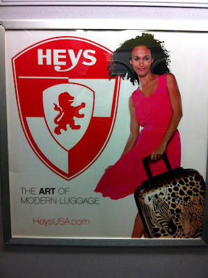
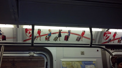
 I'm sure many of you have seen these ads for Heys Luggage while on the train. I've grown to really dislike them for a number of reasons. Maybe I just hate it because I have to look at it so long and it has given me some time to really analyze it, but either way I don't like it. First off, I think the actual luggage itself is pretty horrendous (except for the solid colored ones, those are fine) I just can't imagine buying them myself. But worse yet, the luggage is not the focus of the ad. The Heys logo is so huge it really takes over. The logo itself is very British and old seeming so it's strange that they would make it so huge when they are trying to be "modern." Second, I hate this ad for a reason in the picture below. In these ads there are 4 or 5 different white models in similar dresses holding different pieces of luggage that range from red to other crazy multicolored bags, but somehow the one black model is holding the "ethnic" (for lack of a better word) luggage that has zebras and leopards on it. what is that? hahah they had to have her holding it since she is the wild one or something. I don't know if the makers of the ad had this as a pre meditated thought or if it just ended up like this but either way it struck me as strange and unnecessary. Third, the dresses. really? they have enough money to put these ads all over the subway and in Times Square but not enough to get their models into dresses that aren't cheap and ugly looking.
 As you can tell from this rant I really dislike these ads, and while that might be because I have to look at them for so long I am not alone I found another blogger who posted this as a badly designed subway ad. Also, I must mention these were not things I noticed the first few times viewing the ad but after a long train ride to Brooklyn without my book I spent a lot of time looking at this ad and thinking about it. 
this is the blog where I got the first Heys image http://poornycdesign.wordpress.com/

Ok so i think I've hated on this ad enough and I should give some shout outs to the ads on the subway I enjoy. I really like the Google ads and the Stella Artois ads that say, "this is a glass this is a chalice" and the one that is the 9 steps of pouring a Stella. They are simple, clean, and get the point across. I also want to add another design that I love and that's David Lynch's amazing opening for Twin Peaks. My favorite aspect of the opening is the music done by composer Angelo Badalamenti, which like the music that plays throughout every episode, is perfect. The music is eerie and creepy which is a perfect reflection of the show and its characters (if you haven't seen the show you should). The opening is one of those ones you never want to skip over because it is so aesthetically pleasing. The way that it goes from the bird to the saw mill is reflective of the show, which has important parts that take place at the mill while also showing the beauty of the town of Twin Peaks.
I keep thinking of good designs so here's one more. Generally shows on premium channels such as Showtime and HBO have brilliant openings. Another that I really enjoy is the opening for Game Of Thrones, which does an excellent job of bringing you into the magical world that the show is based on. The opening is SO intense with the music and the 3D version of the world that they digitally build, I love it!
Here is the Twin Peaks opening
and the Game of Thrones opening
Monday, March 12, 2012
Mistah P/ artist statement
 Also here is my artist statement:
Click.
An image is captured for a lifetime with a singular motion of your
extremity. What I see with my eyes is what I want to portray to those
who view my work. The good things and the bad. The bus that caught on
fire and our new puppy.
Regret washes over me when a significant moment passes by and I haven’t
caught it with a lens. Always wishing and wondering, is that what it
actually looked like or is it just a dream mixed with a memory? Taking
pictures makes things come to life helps us preserve those people,
places, and things we hold most valuable. You can express an entire
thought in a single image. Say things hard to say aloud, with a single
image. Tell stories better than ever before, with a snapshot. Remember
the colors of that waterfall or street market more vividly with a single
photograph.
This
is why I take pictures. For myself and for others. A major part of my
life is travel and the ability to capture those unforgettable moments on
a trip gives you the opportunity to relive that moment every time you
look at the image. Living in New York I sometimes forget how colorful
the world is, whenever I feel this I look at my photographs of all the
people and places I’ve been, and I remember. Remembrance is an ability
photography gives us and we must take full advantage of, because as time
goes on our memories fade, but our photos do not.
Monday, March 5, 2012
Usually Unseen

This is a picture I took of a roof of a building off the M train. I go there everyday but rarely look behind me and especially not at the roofs of buildings with trash and rusted air-conditioners. My phone made the contrast between the shadow of the train station on the building's roof and the sunlight so drastic I decided to choose this image. This is also a perspective that I would have never noticed had I not taken this picture.
Thursday, February 23, 2012
Tuesday, February 21, 2012
 This is a photo is by French photographer Robert Doisneau and was taken in 1949. What draws me to this image is the mystical and creepy vibe that comes out of it. The way that the woman's eyes are unable to be seen makes me want to know more about what is going on and makes the image haunting. The crystal ball she is holding is enticing and makes you want to know what she is looking for and/or sees inside of it.
Subscribe to:
Posts (Atom)


