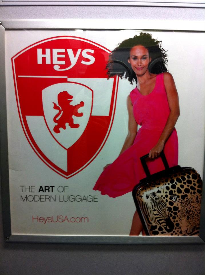
 I'm sure many of you have seen these ads for Heys Luggage while on the train. I've grown to really dislike them for a number of reasons. Maybe I just hate it because I have to look at it so long and it has given me some time to really analyze it, but either way I don't like it. First off, I think the actual luggage itself is pretty horrendous (except for the solid colored ones, those are fine) I just can't imagine buying them myself. But worse yet, the luggage is not the focus of the ad. The Heys logo is so huge it really takes over. The logo itself is very British and old seeming so it's strange that they would make it so huge when they are trying to be "modern." Second, I hate this ad for a reason in the picture below. In these ads there are 4 or 5 different white models in similar dresses holding different pieces of luggage that range from red to other crazy multicolored bags, but somehow the one black model is holding the "ethnic" (for lack of a better word) luggage that has zebras and leopards on it. what is that? hahah they had to have her holding it since she is the wild one or something. I don't know if the makers of the ad had this as a pre meditated thought or if it just ended up like this but either way it struck me as strange and unnecessary. Third, the dresses. really? they have enough money to put these ads all over the subway and in Times Square but not enough to get their models into dresses that aren't cheap and ugly looking.
 As you can tell from this rant I really dislike these ads, and while that might be because I have to look at them for so long I am not alone I found another blogger who posted this as a badly designed subway ad. Also, I must mention these were not things I noticed the first few times viewing the ad but after a long train ride to Brooklyn without my book I spent a lot of time looking at this ad and thinking about it. 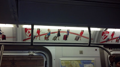
this is the blog where I got the first Heys image http://poornycdesign.wordpress.com/
Ok so i think I've hated on this ad enough and I should give some shout outs to the ads on the subway I enjoy. I really like the Google ads and the Stella Artois ads that say, "this is a glass this is a chalice" and the one that is the 9 steps of pouring a Stella. They are simple, clean, and get the point across. I also want to add another design that I love and that's David Lynch's amazing opening for Twin Peaks. My favorite aspect of the opening is the music done by composer Angelo Badalamenti, which like the music that plays throughout every episode, is perfect. The music is eerie and creepy which is a perfect reflection of the show and its characters (if you haven't seen the show you should). The opening is one of those ones you never want to skip over because it is so aesthetically pleasing. The way that it goes from the bird to the saw mill is reflective of the show, which has important parts that take place at the mill while also showing the beauty of the town of Twin Peaks.
I keep thinking of good designs so here's one more. Generally shows on premium channels such as Showtime and HBO have brilliant openings. Another that I really enjoy is the opening for Game Of Thrones, which does an excellent job of bringing you into the magical world that the show is based on. The opening is SO intense with the music and the 3D version of the world that they digitally build, I love it!
Here is the Twin Peaks opening
and the Game of Thrones opening
 Also here is my artist statement: